The Basics
Introduction
Clustering methods are unsupervised algorithms which identify sub-groups in a data set. These methods create groups of data points that are as similar as possible while making data points between groups as dissimilar as possible. There is no dependent variable in this type of analysis and so it is known as unsupervised learning.
Continuing with the PISA data, we might want to understand what predictors best explain academic performance. This could be achieved by looking at a global model across all countries, which may not be informative given the variation in education systems. Instead we could look at predicting countries on an individual level, but given the number of countries we would need to run many models and this ignores the fact that there is similarity within countries education systems. Therefore, we might want to try and find groups of countries that are similar so we can create prediction models for those groups.
Visualising and Scaling Data
We will cluster countries based on the same random variables used in the PCA (i.e. levels of bullying and teacher discipline). Just like in PCA it is important to visualise the data first. Clusters are determined based on the distance between points so when your variables are in different units one variable may have more weight in the outcomes of clustering than the other. The variables we are using are already scaled. Let’s recap what the data that we are using looks like.
K-means Analysis
Overview
K-means analysis is a method of partitioning your data set into \(k\) clusters, where \(k\) is pre-set by the researcher. Observations in the same cluster are as similar as possible and observations between different clusters are as dissimilar as possible. Clusters are defined by their center (i.e. mean of the observations assigned to each cluster).
To determine the similarity between data points k-means calculates the distance between the two data points. The default is usually Euclidean distance. For other distance measures and how these affect k-means clustering see Patel & Mehta (2012).
The reason why distance is important is that the basic idea of k-means clustering is to minimize the total within-cluster variance. This is defined as the sum of the Euclidean distance, in this case, between each data point and their corresponding center.
The k-means algorithm follows the following steps: 1. Selects \(k\) (assigned by the researcher) random data points as initial cluster centers 2. Assigns each data point to closest centers 3. Updates each \(k\) clusters centers by calculating the new means of all data points 4. Iterates between 2. and 3. to minimize the total within-cluster variance until clusters stop changing or the maximum iterations is reached.
This iterative approach used in k-means and other clustering techniques is Expectation Maximization. For a more in-depth understanding into the statistical concepts that underlie k-means see this towards data science blog post
Deciding on a value for k
The key decision when running a k-means cluster analysis is choosing the optimal number of clusters. There are numerous methods to help choose the optimum number for \(k\), and we will highlight a few here.
Elbow Method
The elbow method method allows you to assess the variance explained (i.e. total within-cluster sums of squares) as a function of the number of clusters used (\(k\)). The code below walks you through this method step-by-step:
# Compute and plot total within-cluster sum of square (wss) for k = 1 to k = 15
k.values <- 1:10

#This function computes wss for a given value of k
wss <- function(k) {
  kmeans(bull_dis[,2:3], k, nstart = 100 )$tot.withinss
}

#Creates vector of extracted wss across all values of k for raw and scaled data
wss_values <- map_dbl(k.values, wss)

#Plots the wss as a function of k for raw and scaled data
plot(k.values, wss_values,
       type="b", pch = 19, frame = FALSE,
       xlab="Number of clusters K",
       ylab="Total within-clusters sum of squares",
       main = "Elbow Method")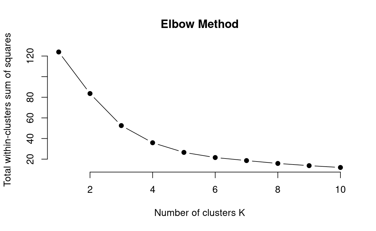
# Now that you understand this method you can use the inbuilt function in r that produces this output for you fviz_nbclust()

# fviz_nbclust(bull_dis[,2:3], kmeans, method = "wss")
This method can be ambiguous surrounding what value of k to choose. Here \(k\) = 3 to \(k\) = 5 could be suitable values for the k-means analysis. So how do we decide? We can use a combination of methods.
Average Silhouette Method
The Average Silhouette Method uses the silhouette coefficient, an internal cluster validation measure assessing how well data points have been clustered by estimating the average distance between clusters. High average silhouette widths (i.e. closer to 1 the better) indicate good clustering. This method looks at the average silhouette of observations across the values of k. The code below walks you through how this method works:
# function to compute average silhouette for k clusters
avg_sil <- function(k) {
  #runs k-means
  km <- kmeans(bull_dis[,2:3], centers = k, nstart = 100)
  #extracts silhouette widths and calculates average
  ss <- silhouette(km$cluster, dist(bull_dis[,2:3]))
  mean(ss[, 3])
}

# Compute and plot wss for k = 2 to k = 15
k.values <- 2:10

# extract avg silhouette for 2-15 clusters
avg_sil_values <- map_dbl(k.values, avg_sil)

plot(k.values, avg_sil_values,
       type = "b", pch = 19, frame = FALSE,
       xlab = "Number of clusters K",
       ylab = "Average Silhouettes")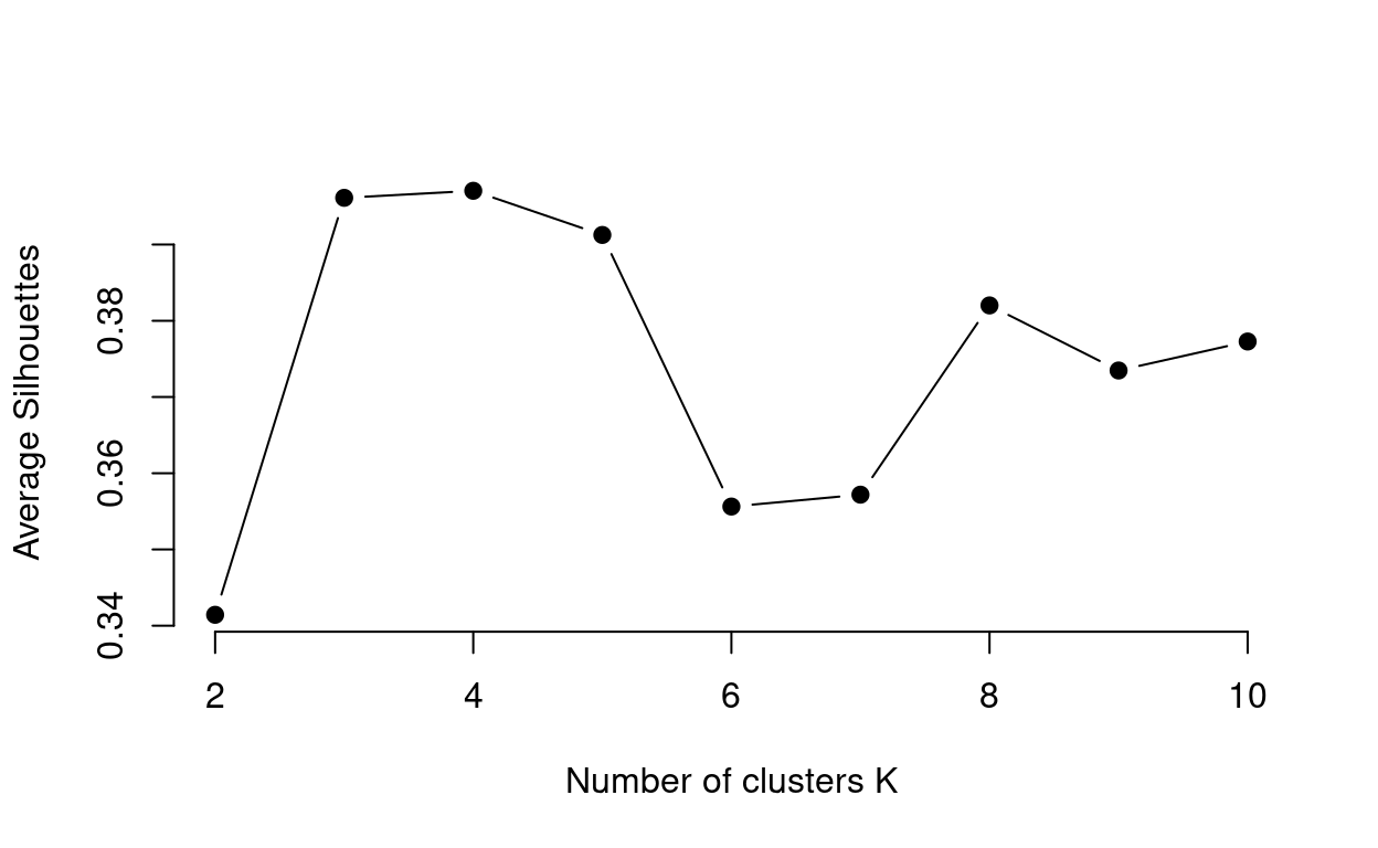
You can see from this plot that \(k\) = 3 or \(k\) = 4, are suitable values of \(k\) as it has the highest average
silhouette value. Now that you understand how the average silhouette
works try using the fviz_NbClust package to run this for
yourself! see the manual elbow method code chunk for
help!
#Look back at the {r manual elbow method} code chunk first to see our explanation

## DATA ##
#make sure you are using the right data set i.e. bull_dis
#Make sure that you are only using the bullying and discipline columns of the data set i.e.  [,2:3]

## FUNCTION ##
#Make sure you have the correct value analysis method i.e. kmeans
#Make sure you have the correct method argument i.e. "silhouette"
## FUNCTION ##
#Make sure you have the correct value analysis method i.e. kmeans
#Make sure you have the correct method argument i.e. "silhouette"
# WARNING: next hint shows full solutionfviz_nbclust(bull_dis[,2:3], kmeans, method = "silhouette")Calinski-Harabasz Index
The Calinski-Harabasz Index is an internal cluster validation measure assessing the ratio of between cluster variance and within cluster variance. A good cluster analysis has high between cluster variance and low within cluster variance. Additionally, between cluster variance increases with \(k\) whereas within cluster variance decreases with \(k\), but the rate of change for both should slow at optimal \(k\). Therefore, the Calinski-Harabasz Index ratio should, in theory be maximized (i.e. the largest value) at optimal \(k\).
# function to compute ch-index for k clusters
ch_index <- function(k){
  #runs k-means
  km <- kmeans(bull_dis[,2:3], centers = k, nstart = 100)
  #calculates ch index from k-means output
  ch <- km$betweenss/km$tot.withinss*((nrow(bull_dis)-k)/(k-1))
}

k.values <- as.numeric(2:10)

ch <- map_dbl(k.values, ch_index)

plot(k.values, ch,
       type = "b", pch = 19, frame = FALSE,
       xlab = "Number of clusters K",
       ylab = "Calinski-Harabasz Index")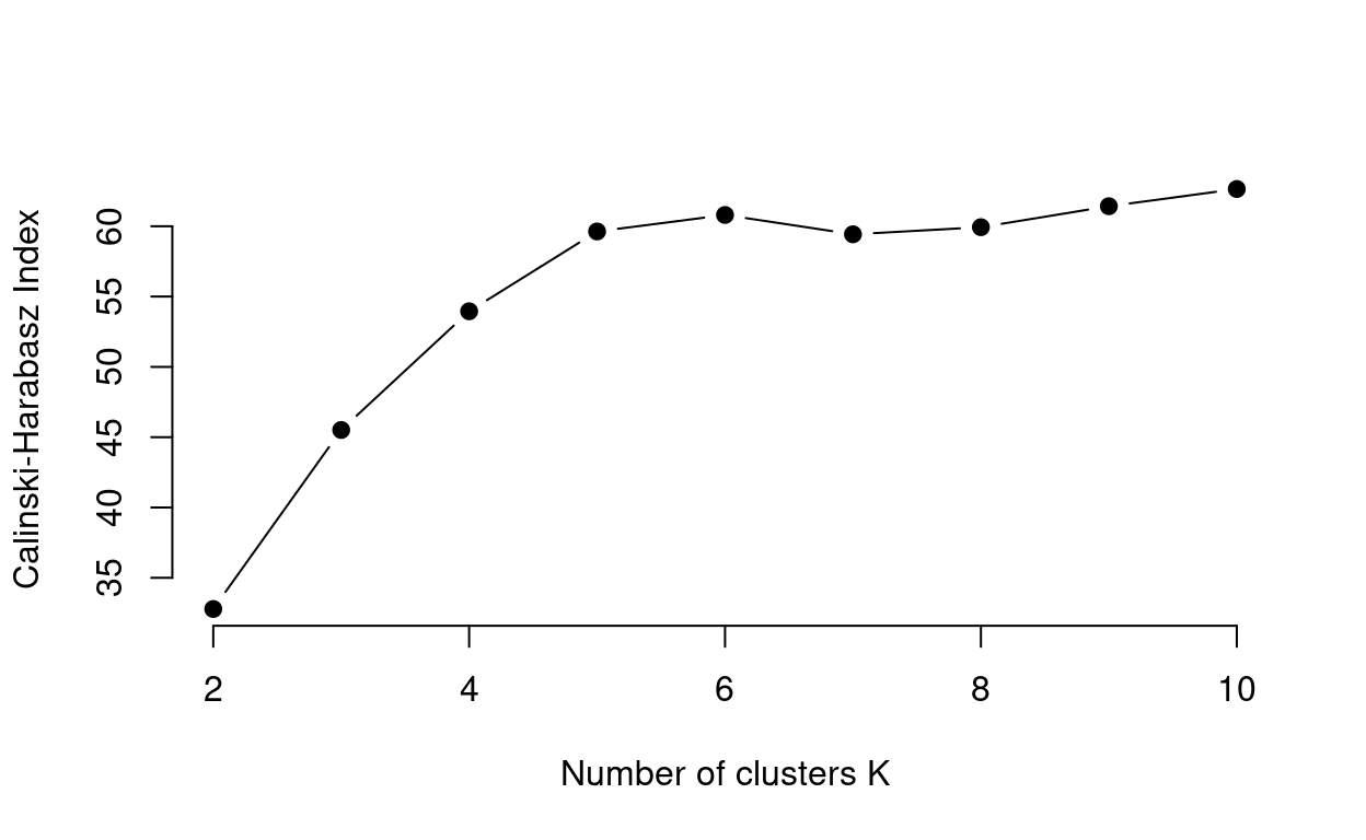
For the data we are working with the Calinski-Harabasz Index output is not as definitive as the other methods. From the plot we can see there are local peaks at \(k\) = 6 and then again at 10.
Using information from multiple methods is a better way to obtain
\(k\) than relying on one. From the
three outputs \(k\) = 4 seems a
reasonable value of \(k\) to use. These
are just three of a variety of ways to determine the optimal \(k\) value. The fviz_NbClust
package has functions for running the different methods. See Alboukadel
Kassambara (n.d.) for a review.
Quick Quiz
Running the Analysis
Now that we have our \(k\) value (\(k\) = 4) we can run our analysis.
#run k means with k = 4, nstart = 100. nstart runs multiple initial configurations of the algorithm and reports the best one!
km_4 <- kmeans(bull_dis[,2:3], 4, nstart = 100)

km_4
## K-means clustering with 4 clusters of sizes 2, 31, 10, 27
##
## Cluster means:
## Bullying Discipline
## 1 3.7758269 -0.8178314
## 2 -0.5734932 -0.6164343
## 3 -0.6085089 1.5269915
## 4 0.6052833 -0.1317793
##
## Clustering vector:
## [1] 4 3 2 4 2 4 2 2 4 2 2 2 2 2 2 4 2 3 4 4 2 2 2 4 2 2 2 2 2 2 2 2 2 4 4 3 2 3
## [39] 2 2 1 4 2 2 4 3 4 4 4 3 4 4 4 3 3 4 4 2 1 4 4 4 4 2 4 4 3 4 2 3
##
## Within cluster sum of squares by cluster:
## [1] 1.773349 12.892986 5.706768 15.526125
## (between_SS / total_SS = 71.0 %)
##
## Available components:
##
## [1] "cluster" "centers" "totss" "withinss" "tot.withinss"
## [6] "betweenss" "size" "iter" "ifault"
The summary provides you with the cluster means for each component and indicates that 71% of the variance was explained by the 3 clusters. Now lets plot the data with country and cluster labels to see what it looks like.
bull_dis <- bull_dis %>%
  #add column indicating cluster of each country
  mutate(Cluster = as.factor(km_4$cluster))

#scatter plot colouring data points by cluster
ggplotly(
    ggplot(bull_dis, aes(Bullying, Discipline, group = Country, colour = Cluster)) +
  geom_point() +
  #axis labels
  xlab('Prevalence of Bullying') +
  ylab('Level of Discipline') +
  theme_minimal(),

tooltip = "group")
Dealing with outliers
One assumption of k-means is that clusters are of similar size and density. You can see from the plot that cluster with Brunei Darussalam and the Philippines violates this assumption. K-means, using Euclidean distance, is very sensitive to outliers and their presence can effect the number and make up of clusters. Brunei Darussalam and the Philippines seem to be outliers when we look at the plot. One way to deal with global outliers is to remove them from your data and re-run the k-means analysis shown below.
#remove outliers
outlier_data <- bull_dis %>%
  #Compares Country names in bull_dis and keeps them if they are not Brunei Darussalam or Philippines
  filter(!(Country %in% c('Brunei Darussalam','Philippines')))
Now that we have our new data set outlier data we need
to assess the optimal value for k and run a new k-means. As you have
already seen us run a k-mean analysis we will be asking you some
questions and to write some code as we go through this section.
#run elbow silhouette and ch index to determine k
fviz_nbclust(outlier_data[, 2:3], kmeans, method = "wss")
fviz_nbclust(outlier_data[, 2:3], kmeans, method = "silhouette")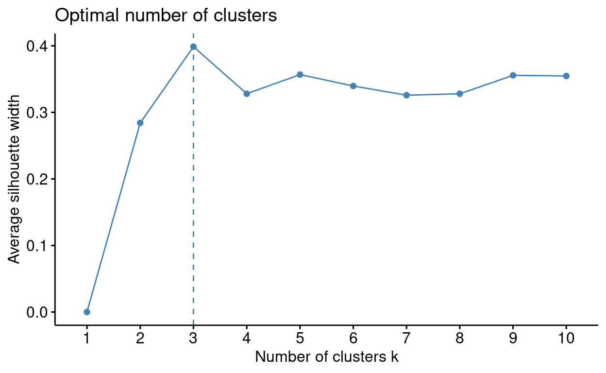
Now that you know the optimal value for \(k\) try to run the analysis. Use the
kmeans function. NOTE: Do not assign your analysis to an
object name.
#Look back at the "Running this analysis section" first to see what we did

## DATA ##
#make sure you are using the right dataset i.e. outlier_data
#Make sure that you are only using the bullying and discipline columns of the data set i.e.  [,2:3]
## FUNCTION ##
#Make sure you have the correct value for k i.e. see question above
#Make sure you are running multiple initial configurations of the kmeans algorithm i.e. nstart = 100
# WARNING: next hint shows full solutionkmeans(outlier_data[, 2:3], 3, nstart = 100)
On your kmeans output (if you don’t have an output press
‘Run Code’) find the value which indicates the variance explained.
Now that we have our results we can visualise them.
So how do we assess local outliers (i.e. outliers with respect to their distance from their surrounding cluster)? We can manually identify local outliers by calculating the distance of data points from their cluster center and picking the top \(l\) distances as outliers. There is no set method to choosing \(l\), a limitation of this approach. The decision surrounding \(l\) can be made using field expertise, however, an arbitrary guideline is 5.
#create vector of centers the length of data to calculate distances
centers <- outlier_km_3$centers[outlier_km_3$cluster,]

#creates vector of distances
outlier_data %>%
  mutate(
    #adds previously created centers to the outlier data frame
    bullcentres = centers[,1],
    discentres = centers[,2],
    #uses original data points to calculate the distance of each data point from its center
    distances = sqrt(rowSums((outlier_data[,2:3] - centers)^2))) %>%
  #arranges data frame by distances in descending order
  arrange(desc(distances)) %>%
  #Prints the top 10 largest distances in the data frame
slice(1:5)This method outlines 5 more countries that could been seen as local
outliers. The kmod function allows you to do k-means
analysis with simultaneous outlier detection. The k-means algorithm has
been updated to form clusters while simultaneously identifying and
accounting for outliers. The outliers are defined in a similar method as
outlined above. For an detailed outline of the updated algorithm that
the kmod package runs see Chawla & Gionis
(2013) In this new approach the researcher has to specify \(k\) clusters and \(l\) outliers.
#run k-means with k = 3 from the elbow and silhouette and l = 5
#
kmod_3 <- kmod(outlier_data[, 2:3], k=3, l=5)
## Beginning k-means-- clustering
## ......
## Clustering complete in 6 iterations.
##
## k = 3 l = 5 Cluster sizes: 16 28 19
## (between cluster sum sqr / total sum sqr = 73.66015 %)
##
## Centroids:
## Bullying Discipline
## [1,] -0.01461326 0.7193953
## [2,] -0.64134253 -0.5607691
## [3,] 0.71184105 -0.5254704
##
## Outliers:
## # A tibble: 5 × 2
## Bullying Discipline
## <dbl> <dbl>
## 1 -1.48 2.12
## 2 -0.0102 2.47
## 3 -0.567 2.22
## 4 -0.995 1.82
## 5 0.201 -1.85
##
## Available components:
## [1] "k" "l" "C"
## [4] "C_sizes" "C_ss" "L"
## [7] "L_dist_sqr" "L_index" "XC_dist_sqr_assign"
## [10] "within_ss" "between_ss" "tot_ss"
## [13] "iterations"#index country names of outliers from the l-index output
outlier_data$Country[kmod_3$L_index]## [1] "Japan" "Kazakhstan" "Albania" "Belarus" "Argentina"#plot data coloured by cluster
kmod_data <- outlier_data %>%
mutate(cluster = as.factor(kmod_3$XC_dist_sqr_assign[,2]))
#plot data coloured by cluster
ggplotly(
ggplot(kmod_data, aes(Bullying, Discipline, group = Country, colour = Cluster)) +
geom_point() +
#axis labels
xlab('Prevalence of Bullying') +
ylab('Level of Discipline') +
theme_minimal(),
tooltip = "group")
The clusters are identical to the prior k-means example except the
kmod approach explains a higher proportion of variance
(73.7%) as the cluster centers are computed while accounting for the
local outliers. Try and run a kmod analysis for yourself
with k = 3, l = 3. Assign this analysis to
kmod_k3l3 <-.
#Look back at the {r kmod} code chunk first to see what we did

## DATA ##
#make sure you are using the right dataset i.e. outlier_data
#Make sure that you are only using the bullying and discipline columns of the data set i.e.  [,2:3]
#Make sure you have the correct value for k and l specified
## FUNCTION ##
#Make sure you have the correct value for k and l specified
# WARNING: next hint shows full solutionkmod_k3l3 <- kmod(outlier_data[, 2:3], k=3, l=3)
Now that you have stored your analysis as kmod_k3l3 you
can use this to assess the three countries that were treated as local
outliers. Use code to index the country names of outliers from the
l-index output.
#Look back at the second line of code in the {r kmod} code chunk first to see what we did

## DATA ##
#You first need to index the outlier data country column i.e. outlier_data$Country
#You also need to index the L-index output from your kmod_k3l3 analysis i.e. kmod_k3l3$L_index

# WARNING: next hint shows full solution
outlier_data$Country[kmod_k3l3$L_index]
With kmod the lack of discussion around how to set the
outlier parameter \(l\) and the loss of
information due to removing outliers are limitations of this approach.
Therefore, if we are working with data that has numerous or large
outliers then it may be best to assess a different method.
K-means is the most commonly known approach but the decisions over what distance measure, \(k\) or \(l\) to use has a great impact on the results. There is no single right answer, researchers should experiment with different combinations to find the most interpretable/useful solution. The main disadvantage of this method though is having to pre-specify the number of clusters \(k\). The rest of this section will cover two other clustering methods that do not pre-specify \(k\).
Interactive K-means
Take a look at how specifying \(k\) affects the clustering solution.
Try running two k-means analyses with 4 clusters (by moving the
slider away from 4 and back again). Notice how the clusters may differ
slightly even though \(k\) was 4 both
times. This is due to the fact that the k-means algorithm picks random
cluster centers as a initial step. If you were to run many ‘iterations’
of a k-means analysis, your results would be more consistent. That is
why setting the nstart parameter is important.
Hierarchical Clustering
Overview
The Hierarchical Clustering outlined in this section is a bottom-up approach which considers each object (i.e. each country) as a single-element cluster (leafs) initially and then the two most similar clusters are combined into a bigger cluster (nodes). This process continues until all leafs are a member of one cluster (the root). This method by default is calculated via Euclidean distance. The leafs of nodes lower down in the hierarchical tree are more similar than the leafs of nodes higher up. Hierarchical clustering is depicted through dendrograms and the height indicates the similarity of different leafs.
Hierarchical clustering determines the dissimilarity between two groups of observations in the dendrogram through ‘linkage.’ Their are numerous linkage methods: complete, average, single and centroid. This section will focus on complete and average linkage as these produce more balanced clusters and are more robust to outliers than single linkage. In addition, they do not suffer from inversion of cluster nodes like centroid linkage.
Complete Linkage: Dissimilarity is computed by calculating all pairwise dissimilarities of leafs in cluster A and cluster B and taking the largest value to be the distance between two clusters.
Average Linkage: Dissimilarity is computed by calculating all pairwise dissimilarities of leafs in cluster A and cluster B and taking the average value to be the distance between two clusters.
Below shows the outcome of hierarchical clustering using complete and average linkage methods.
#dist() computes the matrix to be used for clustering via Euclidean distance
#method sets your linkage choice = complete linkage
hclust_comp <- hclust(dist(bull_dis[,2:3]), method="complete")

#puts cluster output in dendrogram format
dend_comp <- as.dendrogram(hclust_comp) %>%
  #sets leaf labels in country codes rather than their numeric index
  set("labels", bull_dis$Country[hclust_comp$order])
#plots dengrogram
plot(dend_comp, ylab = "Height", main = 'Complete Linkage')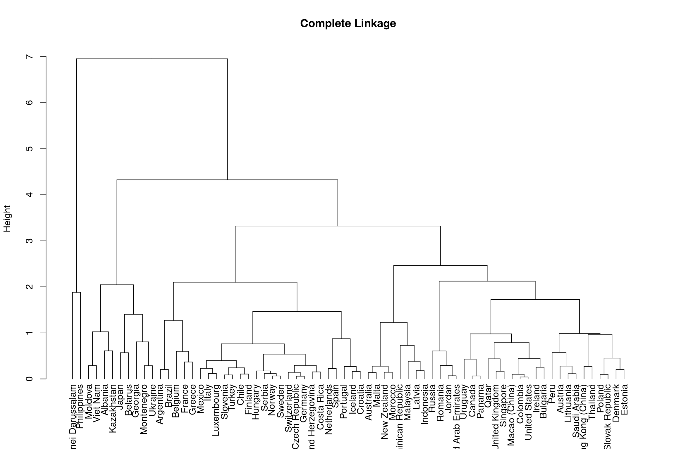
Note that you have seen us run the hierarchical clustering with
complete linkage try and run hierarchical clustering with average
linkage using the hclust() function. Do not assign your
analysis to an object.
#Look back at the first line of code in the {r hclust complete} code chunk first to see what we did

## DATA ##
#Make sure you are using the right dataset i.e. bull_dis
#Make sure that you are only using the bullying and discipline columns of the data set i.e.  [,2:3]
## FUNCTION ##
#Have you remembered to compute the distance matrix of the data i.e. dist(bull_dis[,2:3])
#Have you used the right linkage method i.e. method = "average"
# WARNING: next hint shows full solutionhclust(dist(bull_dis[,2:3]), method = "average")Below is a dendrogram using the hierarchical clustering you just ran:
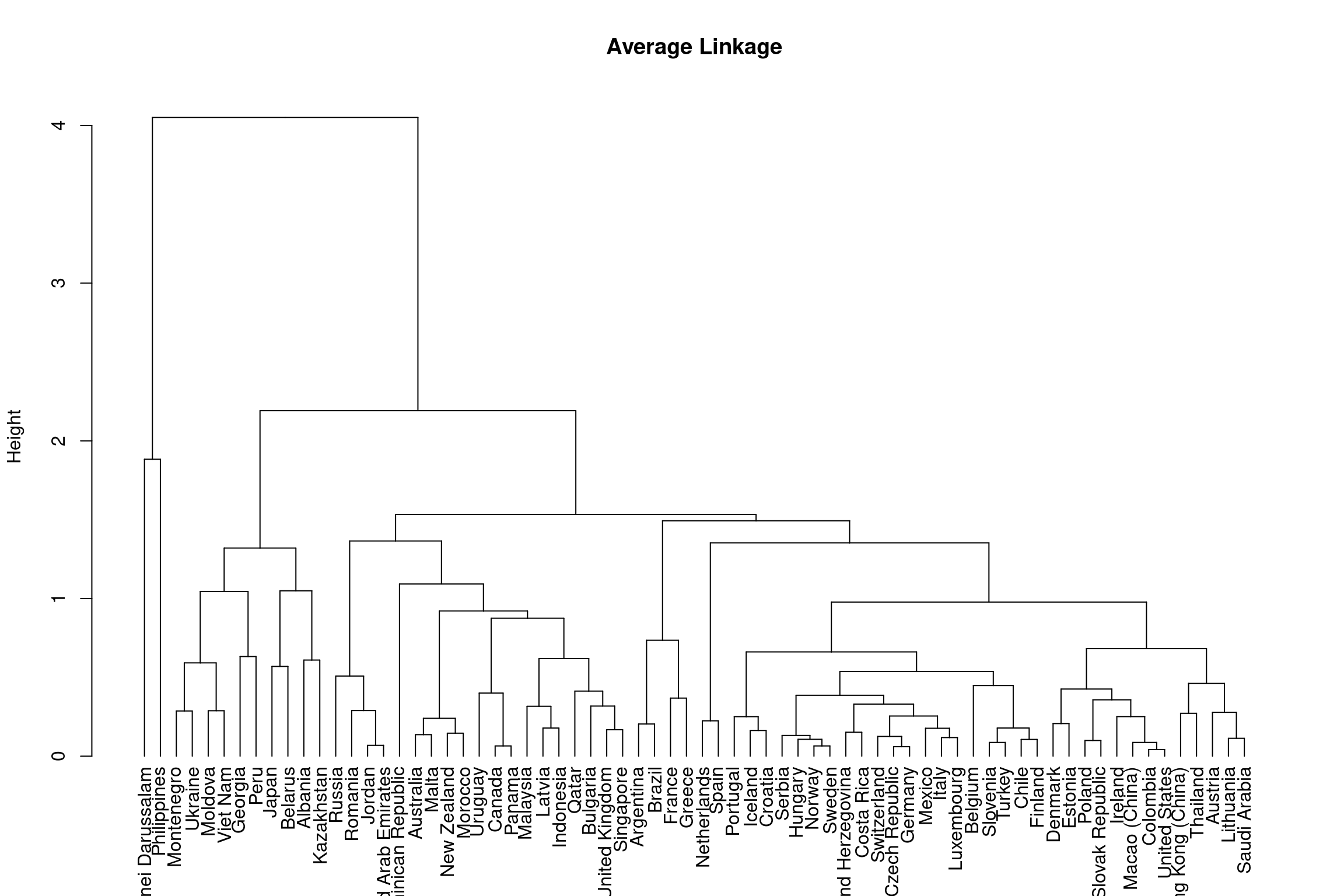
As you can see from the dendrograms each country is its own leaf and as we move up the hierarchy countries that are similar to each other are combined into nodes. However, the way in which the countries are combined is different for each linkage method.
So now that we have our dendrograms how do we decipher how many clusters there are?
Height and the number of clusters
The height of the dendrogram is used to determined the number of clusters, much like \(k\) did in the \(k\)-means method. By cutting the dendrogram at different heights, we can identify different subgroups. Below is an example on the complete linkage dendrogram. You should assess the different cluster groups across different height values.
dend_comp = as.dendrogram(hclust_comp) %>%
  set("labels", bull_dis$Country[hclust_comp$order])
plot(dend_ave, ylab = "Height", main = 'Complete Linkage')
#forms rectangular border around the number of specified sub-groups k
rect.hclust(hclust_comp, k = 3, border = 2:5)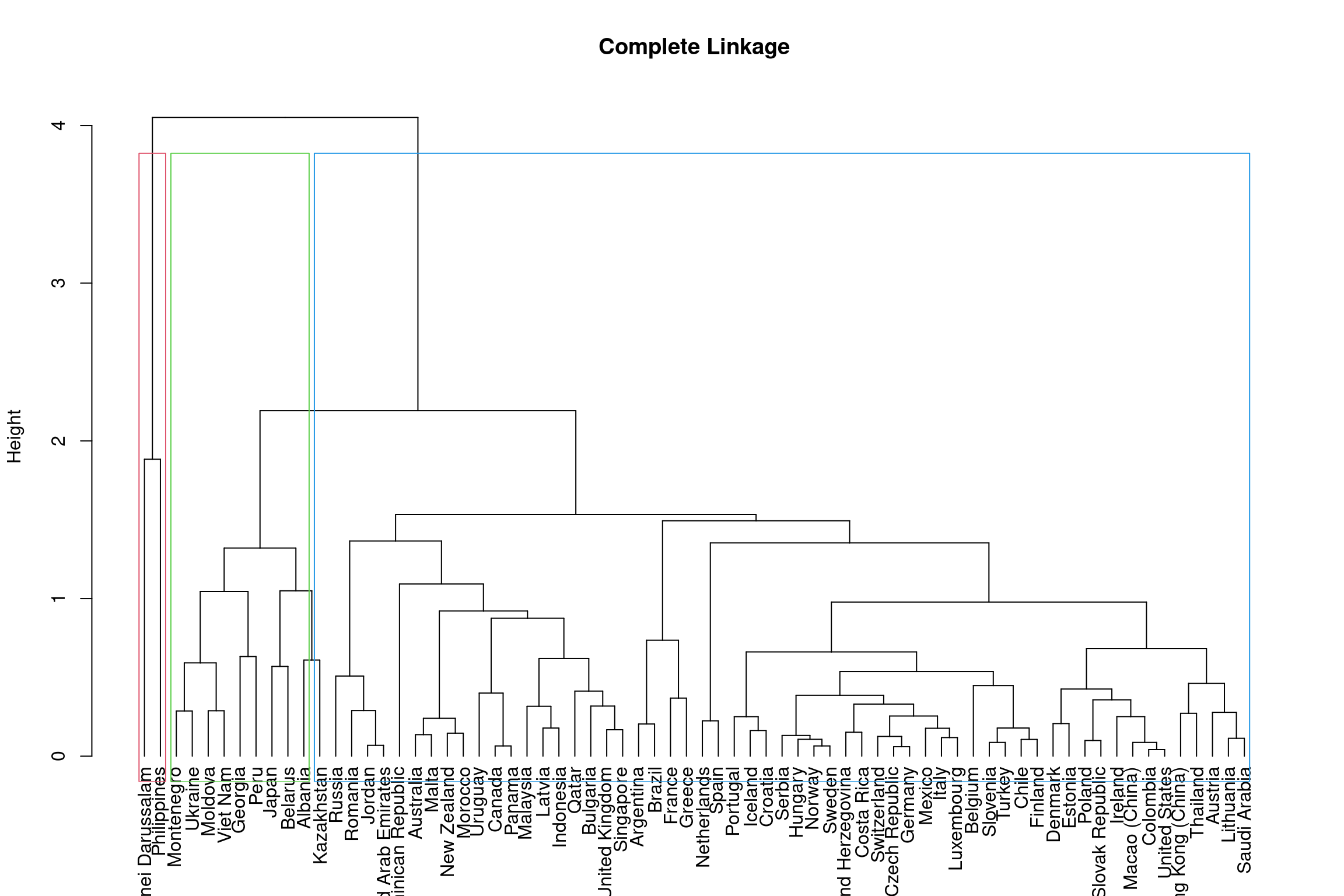
dend_comp = as.dendrogram(hclust_comp) %>%
  set("labels", bull_dis$Country[hclust_comp$order])
plot(dend_ave, ylab = "Height", main = 'Complete Linkage')
#forms rectangular border around the number of specified sub-groups k
rect.hclust(hclust_comp, k = 4, border = 2:5)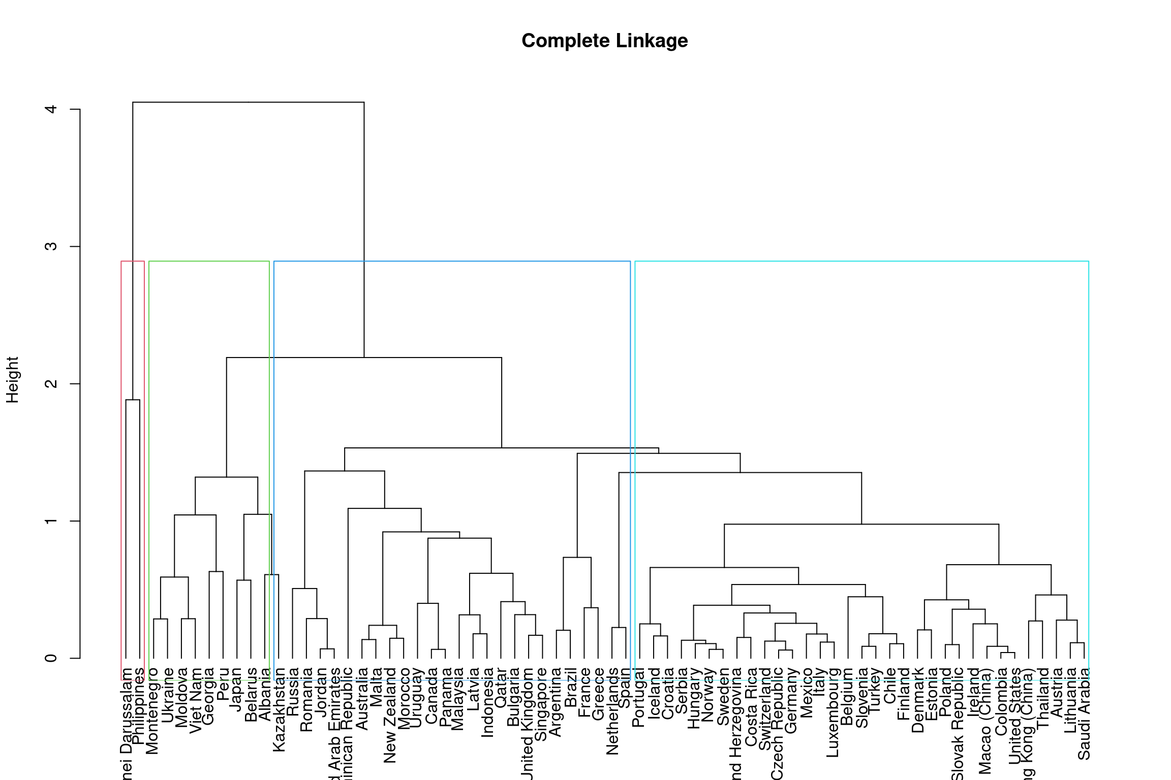
To get 3 clusters the height of the dendrogram is cut around 3.8 and
for 4 subgroups it is cut around 3. Using similar code as we have above
create a dendrogram for hclust_ave (hierarchical clustering
with average linkage) for \(k\) = 3.
Use the as.dendrogram() function and assign your
as.dendrogram() to an object dend_ave = so
that it can be used in the plot() function.
#Look back at the first line of code in the {r height complet} code chunk first to see what we did

## DATA ##
#Have you correctly assigned your dendrogram? See instructions above.
#Make sure that you are using the right analysis object i.e. hclust_ave
#Make sure you are setting the labels correctly i.e. set("labels", bull_dis$Country[hclust_ave$order])

## FUNCTION ##
#Make sure you have used the plot function to dictate what you want to plot and give informative labels i.e. plot(dend_ave, ylab = "Height", main = 'Average Linkage')
#Have you used rect.hclust to create the coloured boders round the clusters i.e. rect.hclust(hclust_ave, k = 3, border = 2:5)
# WARNING: next hint shows full solutiondend_ave = as.dendrogram(hclust_ave) %>%
set("labels", bull_dis$Country[hclust_ave$order])
plot(dend_ave, ylab = "Height", main = 'Average Linkage')
rect.hclust(hclust_ave, k = 3, border = 2:5)
You can also use the function cutree to get an index of
which countries belong to each cluster to visualise these in the
original scatter plot form and see how this method groups countries in
comparison to k-means.
k4 <- cutree(hclust_comp, k = 4)

k4_bull_dis <- bull_dis %>%
  mutate(Cluster = as.factor(k4))
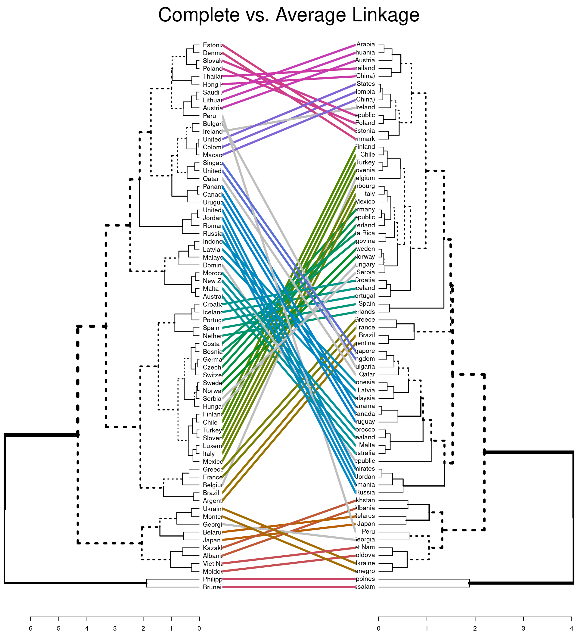
Comparing two dendrograms
You can also compare two dendrograms to see how using different
linkage methods affects the clustering of leafs using
tanglegram.
#default comparison
tanglegram(dend_comp, dend_ave,
           main = "Complete vs. Average Linkage"
           )
#comparison using entanglement
dend_list <- dendlist(dend_comp, dend_ave)
tanglegram(dend_comp, dend_ave,
  highlight_distinct_edges = FALSE, # Turn-off dashed lines
  common_subtrees_color_lines = FALSE, # Turn-off line colors between dendrograms
  common_subtrees_color_branches = TRUE, # Color common branches
  main = paste("entanglement =", round(entanglement(dend_list), 2))
  )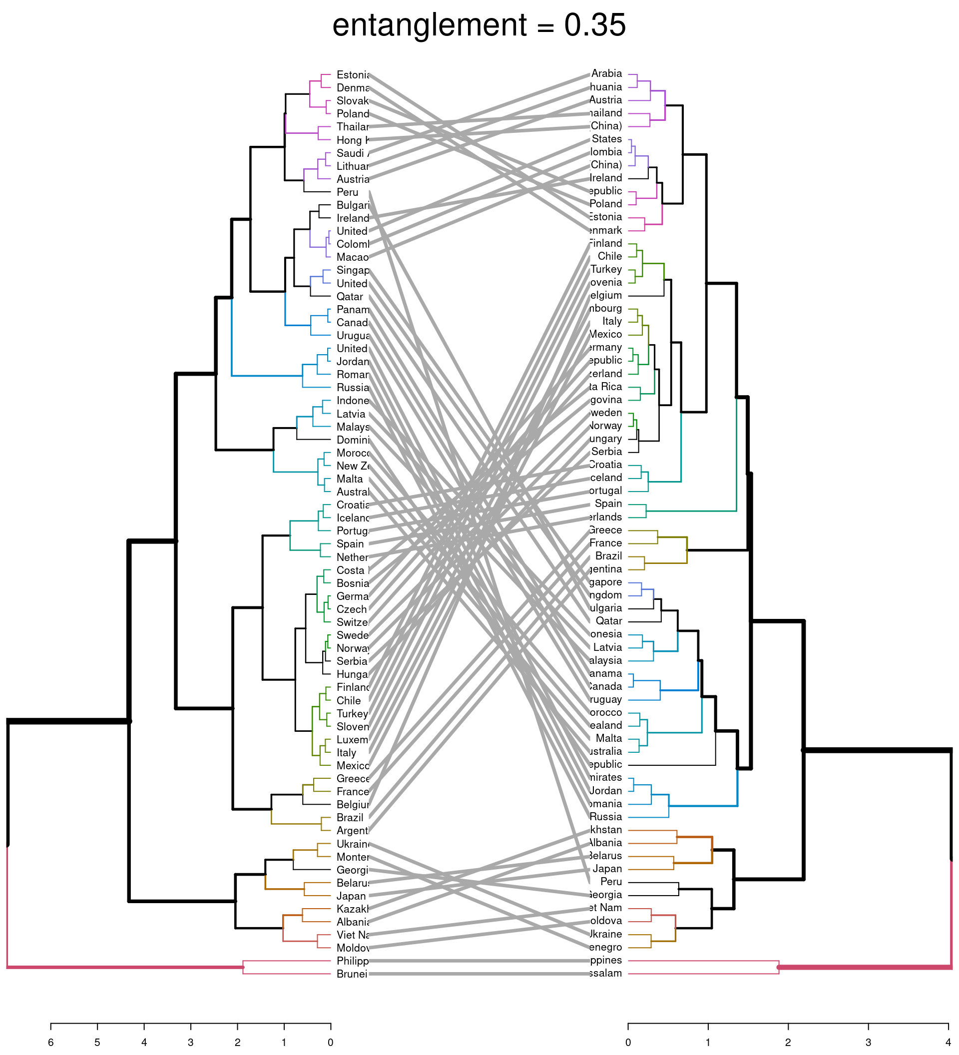
The first plot highlights (via coloured lines) which countries have been fused in the same way across both dendrograms. The dashed lines show unique combinations of branches not seen in the other dendrogram. The second plot shows the branches that are common between the two dendrograms. It also assess the entanglement of the two dendrograms; a measure of how in line the two dendrograms are. Entanglement is a value from 0 (full entanglement) to 1 (no entanglement), with lower values indicating higher alignment. This illustrates how different linkage methods lead to dissimilarity being interpreted differently.
The height you choose to cut the tree and the linkage methods used are decisions that effect the results of analysis. You should consider and range of values and find the solution that demonstrates some interesting aspect of your data.
Interactive Hierarchical Clustering
See how changing the height at which the cluster ‘tree’ is cut changes the clusters. The clustering solution at each height will be identical whenever it is cut at that height (unlike how k-means solutions can vary, given the same value of \(k\)). Notice how changing the distance calculation method changes the entire structure of the tree, including its maximum height.
DBSCAN
Overview
Density Based Spatial Clustering of Applications with
Noise (DBSCAN) is another method that does not need you to
pre-specify the number of clusters. It also allows the data to be
clustered into whatever arbitrary shape best fits the cluster. This is
more flexible than the k-means and hierarchical approaches. It is
designed to help work with data where we are dealing with clusters of
differing size, shape and density. This method groups together data
points that are in close proximity based on distance (i.e. Euclidean or
other) and a minimum number of points. It identifies outliers in the
data set that sit in a low density space and does not include these
within the resultant clusters. This is advantageous over
kmod as you do not need to preset the number of
outliers.
The two parameters the researcher needs to estimate when using this method are:
‘eps’ = epsilon, the \(\epsilon\)-neighborhood is defined as the radius of the neighborhood around the core data point (data point with neighbor count \(\ge\) MinPts). If eps is too small then a large proportion of the data will not be modeled and treated as an outlier. If eps is too large then the majority of data points will be in the same cluster.
‘MinPts’= the minimum number of neighbors within ‘eps’ radius. With larger data sets, this parameter value should be higher. MinPts must be at least 3 as we need a minimum of 3 points to form a dense region. If MinPts is \(\le\) 2 the output is the same as a Hierarchical cluster with single linkage and height cut at \(\epsilon\).
For a more indepth look at the DBSCAN algorithm and r implementation see Hahsler, Piekenbrock & Doran (2019).
Determining epsilon
So how do we determine these parameters? As we are working with quite a small data set we will set MinPts to 3. \(\epsilon\) can be inferred using the average distances of each point to their K-Nearest Neighbors, where \(k\) is specified by the researcher in relation to MinPts. This is ploted in ascending order as a function of \(\epsilon\). You are looking for an elbow indicating a sharp change in the KNN distance curve.
#uses distance method to determine eps
dbscan::kNNdistplot(bull_dis[,2:3], k = 3)
#creates dashed line across plot
abline(h = 0.80, lty = 2)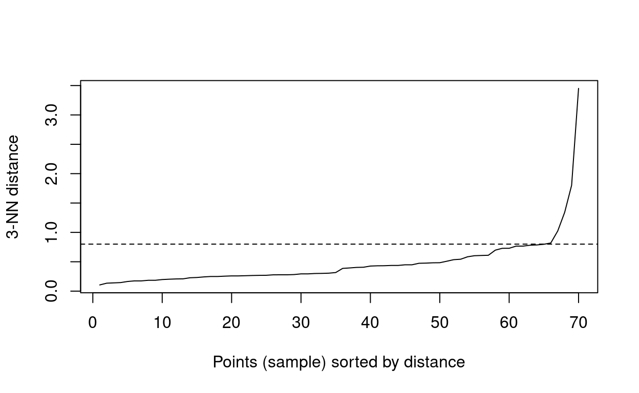
You can see from the above plot that the elbow begins at around \(\epsilon\) 0.80.
Running Analysis
Now that we have our two parameters you can run the analysis. We will
use the dbscan function in the fpc package
rather than the one in the dbscan package. This is due to
the output of the former being more detailed.
#runs density cluster analysis
db <- fpc::dbscan(bull_dis[, 2:3], eps = 0.80, MinPts = 3)

#add cluster column to table
db_data <- bull_dis %>%
  mutate(Cluster = as.factor(db$cluster))

#scatter plot by cluster
ggplotly(
    ggplot(db_data, aes(Bullying, Discipline, group = Country, colour = Cluster)) +
  geom_point() +
  #axis labels
  xlab('Prevalence of Bullying') +
  ylab('Level of Discipline') +
  theme_minimal(),

tooltip = "group")
#there is also an inbuilt plot function that can be used
fviz_cluster(db, data = bull_dis[, 2:3], stand = FALSE,
#ellipse = FALSE, show.clust.cent = FALSE,
#geom = "point", palette = "jco", ggtheme = theme_classic())
The outliers are identified by cluster = 0 in this plot. You can see here the resultant clusters are different to those in the previous methods but DBSCAN has managed to form clusters taking into account outliers that we had noticed could be problematic in the previous methods (i.e. Brunei Darussalam and Philippines).
Interactive DBSCAN
Try using DBSCAN yourself. One thing you can notice here is that the optimal size of \(\epsilon\)-neighborhood changes in response to the number of minumum points per cluster.